Thursday, October 31, 2019

Milestones are Important

Yes, I know My Sculpting Skills are Bad

A few months ago, an alcoholic friend celebrated five years of being clean.  I knew him when he was at his worst, and while we don't see each other all that often, I've tried to be supportive of him with his struggles against his demons.

As part of that, I modified and painted a mini for him.  Playing off the idea of "clean" I took Privateer Press' "Blighted Bather" model and did some modifications.  I filed off all the blight, to turn her into just a slightly-angular-looking human.  Originally she was holding a beer stein, which really didn't seem appropriate, so I drilled through it and had her holding a banner instead.  I made a base texture using a GreenStuffWorld rolling pin.

Unfortunately, I was a little rushed to get it done (story of a lot of my painting, lately), and didn't take a good photo.  The best I have is this:

Isn't the Rubber-Shredder Adorable?

The banner reads "5 Years Clean" and the base says "August 2019."

Around the time I painted it, another friend told me that he would be celebrating 15 years of being sober in October.  I figured that was even more worthy of celebration.

I had the idea for the modification almost immediately, but then I kind of went into a painting funk.  By the time I got around to working on it, once again, I didn't have a lot of time to get things done.  Or maybe that is just an excuse I'm telling myself.

For this, I started with another Privateer Press model, an alternative sculpt for Ashlynn D'Elyse.  I bought some plastic bottles meant for doll houses (because, you know, teaching young children that a house needs beer is good parenting) and used my extremely limited sculpting skills to put a cartoon-y face on the bottle.

She originally had her left foot on some stone stairs, but I wanted her stepping on the bottle, so I removed them.  Unfortunately, in doing so I ended up cutting off her left foot.  I sculpted a replacement, but it is *really* shoddy.  Fortunately, that isn't a focal point of the model.  I then had to add some cork to raise her up enough to make the pose natural.

I think the model originally had an energy-backpack or something, but somewhere along the line I misplaced the part.  I filled in the divot with some more putty.  Again, it doesn't look very good if you look closely, but it is good enough to pass from a distance.

There are some other problems with the model; there are some pretty huge glue blobs, if nothing else.  However, I actually am really proud of how far I managed to take my highlights on the flag and cloak.  They show up well from a distance, which is something that I always struggle with.

 The banner reads "October 2019"
 The base reads "15 Years of Triumph Over the Bottle."
Ignore the space between her shoulder blades.  Please.

Thursday, October 24, 2019

Warcry Iron Golems

A Long-Delayed Project Reaches Completion

For me, one of the most exciting releases this year has been Games Workshop's "Warcry."  It is a fast-paced skirmish game, with well-designed terrain and accompanying rules, and a lot of great models.

I very quickly painted up the terrain that came in the core set (more on that in another blog post, possibly).  Then I started on some of the chaotic beasts (sort of npcs or obstacles in the game) and I burned out a bit.  I had what I thought was a great idea for a color scheme, but it just wasn't coming together as well as I pictured it in my mind.

So, I put them to the side, and started on the Iron Golems, which I thought would be straightforward to get done.  Unfortunately, pretty much the same thing happened.  They weren't looking terrible, but they didn't live up to my vision of how they would turn out.  Combined with a general lack of time, and a commitment to hiking every weekend, I pretty much stopped painting for awhile.  I'd pick up a brush every once in awhile, and I did some more terrain, but I just couldn't motivate myself to push forward and finish this project.

A few things happened this week that got me out of my funk.  One of the painters that I follow closely made a video about "what to do when you fail."  Basically, he said to finish it up and move on; even if it isn't as good as you'd like, you still have a useful game piece that is a lot better than an unpainted mini.  I knew this, of course, but it helped to hear that even a competition-winning painter has his failures.

Then, there were two opportunities to get some painting done.  A local game store had a painting night, and while I was the only person that showed up, I still accomplished a bit.  A couple days later, I did a painting lesson for a friend, and got some more done.  I was really close to completion at that point, so I grabbed an evening this week to wrap them up.

All in all, I'm reasonably happy with them in the end.  The highlights don't show up as well as I'd like, and there are some places where I cut corners just to get them done, but I think the overall impact is still there.  I'm pleased that I came up with a decent original color scheme, since usually I follow the studio scheme pretty closely.

At any rate, I'm sure anyone here really wants to see the pictures, so here you go...

Signifier:  This model could be built in this version, or as a "prefector."  Everyone else I know built the prefector, so I had to be different.

Armator:  One of the things I like about this warband is that the members are of different races.  This is just a random dwarf that joined up.
Drillmaster:  This guy was a little bit of a pain to paint, since the chain was flexible enough to bounce away from the paintbrush.
Dominar:  The leader of the group.
Ogor Breacher:  Another off-race model, this was my test to decide on the color scheme.
Iron Legionaries:  There were some weapon choices here, but it doesn't make much difference.  I like the blending I did on the shield, but it doesn't show up well here.
Iron Legionary with Bolas:  Another choice, this could have been built instead with two hammers.  I thought the bolas looked cooler.


Thursday, June 6, 2019

Miniature Rescue

In Which I Partially Redeem Myself

Let's start with a little background.  "Miniature rescue" is a term used when taking a poorly-done model, possibly damaged, and trying to get it up to a higher standard.  It is often done when buying used models, as there are a lot of unskilled hobbyists out there, and also things can break during transport.

In this case, I'm just trying to repair a model that I've always hated my work on.

Malifaux is a miniature-based skirmish game, set in a mish-mash setting of steampunk, Victorian England, the old west, and horror, with some other stuff thrown in for good measure.  It is a wild, crazy world, and the game has one of the most tight rulesets for competitive play that is out there.

I'm not a competitive player.  I'm much more into painting and trying to have fun rather than trying to devote my life to learning the abilities of 200 different models and how to counter them.

There is a local player who is really into Malifaux.  He plays in national tournaments, and usually makes at least the top 3.  He has tried to drum up a local scene, but hasn't had much success.

Despite our completely different outlooks on games, I have agreed to play against him on Sunday.  I painted up some Malifaux models in the past, so I was digging through my models to see what kind of a squad I could put together.  The problem is, the rules are transitioning into a new edition, and the stuff I painted before doesn't work together any more.  I had painted an "Outcast" model which used to work as a mercenary, but now he doesn't.  So I needed something to replace it.

One of the reasons I stopped painting Malifaux was a bad experience.  I really liked the look of Colette's crew, and I painted up Cassandra.  She is supposed to be a beautiful performer and swordswoman.

I don't know what it was, but at the time I couldn't make her look like anything but a mutant muppet.


There are 3 or 4 major problems here.  Most horrible are the eyes.  I tried several times to get them right, and at the time that was the best I could do.  Second is the hair.  Not only is the color off, but barely visible in the photo is that I somehow got gold paint all over the side of her head.  The contact between the model and the base is minimal, and she kept breaking off and requiring more glue, so there are huge globs of it visible.  The fourth, more arguable mistake is that the highlighting probably doesn't go far enough.

I had a bout of insomnia last night, and decided I'd do what I could to try and fix the problems.

I painted over the top half of the face, and started over.  I probably should have shaded the eye sockets before painting the eyes, but I was sort of able to get a black rim around the eyes by pooling some black wash into the eyes and then wicking the majority away.

I painted several layers over the gold, trying to cover it up.  The problem is that metallics are really hard to cover up with acrylic paint, and yellow has poor coverage over anything.  Putting those problems together, I had to do paint over paint over paint to get it done, and by the time I was done there was almost no definition left to the hair.  I did my best to paint some definition back in, and I was more successful than I thought I'd be, but I'm still not completely happy with it.

For the glue globs, there was  only so much I could do.  I painted over them, and least they somewhat blend into the base now.

I took some of the highlights further up, and smoothed some rough places out.  I could do more, probably, but I'm much happier with this now.  It isn't perfect, but I'm not ashamed to put the model on the table like I was before I did the corrections.


Zooming in, it still looks pretty terrible, honestly.  I think it is time to move on to something else, though.

Wednesday, June 5, 2019

Finishing the Set on a Sour Note

Bilbo and Beravor

I'm not sure what it is about these models, but I'm just not happy with them.  Maybe it is the eyes, which I worked and worked on, but couldn't get right.  Maybe it is Bilbo's dagger, which after trying 6 things, nothing worked right.  Maybe it is just that I'm tired of this project, and ready to move on to something else.  Whatever it is, working on these felt more like a chore than fun, and I probably rushed a few areas just to get them done.

I don't think they are terrible, but I don't think they pop out enough when viewed from a distance, and when you look close you can see some problems, particularly with the faces.

The upside is that no one seems to care about these characters, so their quality doesn't really matter.


In the end, while these models aren't my proudest moment, I'm happy with the whole set.  I got 31 models done in about five weeks, which is a pretty breakneck pace for me.  There are things that could be improved, but I think I managed a good balance of speed versus quality.  There is always something cool about playing with a fully painted game, and being able to say "I did that."

Bring on the expansions... just not immediately.  

Thursday, May 30, 2019

Just a Troll Post

In Which a Task Long Dreaded Turned Out Easier than Expected

I've mentioned several times that I had no idea what to do with the Journeys in Middle Earth troll model.  The skin would have to be different from any that I've done before, and I was intimidated by that..

Well, a YouTube painter who goes by the name of "Sorastro" recently put out his guide on painting this model.  I didn't really follow his guide, but it gave me enough inspiration to jump in and try some stuff.  In the end, it turned out to be a fun model to paint, and it was very quick to do since most of the model is the same flesh.

The skin tone didn't really turn out the way I was going for.  That being said, I like how it ended up.  One of the things I experimented with after watching Sorastro's video was mixing in some tonal variations.  There is a bit of red mixed into some of the facial areas, and some green mixed into the occasional shadow.  These are hopefully subtle, but I think they add to the visual interest of the model in a way that I don't think most people would notice.

I almost screwed up his left foot.  I have no idea how it happened, but there was a big smear of basing paste over it.  I caught it just as it started to dry.  I was able to clean most of it off, but there is still some residue if you look closely.  But hey, a troll walking around barefoot is going to get some mud on his feet, right?

I probably overdid the blood effects on his hammer, but it isn't so bad as to go back and redo it.


Now, on to the last two minis, then I can work on a different project...


Tuesday, May 28, 2019

Gimli and Aragorn

Two More Heroes Join the Fray

I've had these miniatures painted since last week, but I was just too lazy to take photos.

Two more models for my Journeys in Middle Earth set are done.  Now there are only two more heroes (Bilbo, and Fantasy Flight Games original character Beravor), and the troll.  A painter that I occasionally watch on YouTube recently did a video on the troll, and while I don't think I'll follow his scheme exactly, it gave me enough inspiration to break through my painter's block.

Anyway, not really much to say here.  On to the photos.


I mainly decided to do these because I'm getting bloody tired of painting brown.  That also influenced my color scheme; I deviated from the concept art because there were too many browns there.

I really like the way Gimli turned out.  Aragorn, I'm a bit less happy with.  I still think he is fine, but there isn't as much contrast between the cloak and the shirt as there should be to make the model really pop.

On both models, I kind of phoned it in for the lower portion.  The boots are just black and then a drybrush of gray, for example.  However, I want the viewer's focus to be on the face and upper portions, so I don't feel too guilty about it.

Thursday, May 23, 2019

Starting the Heroes

Long Winded, Lots of Pictures

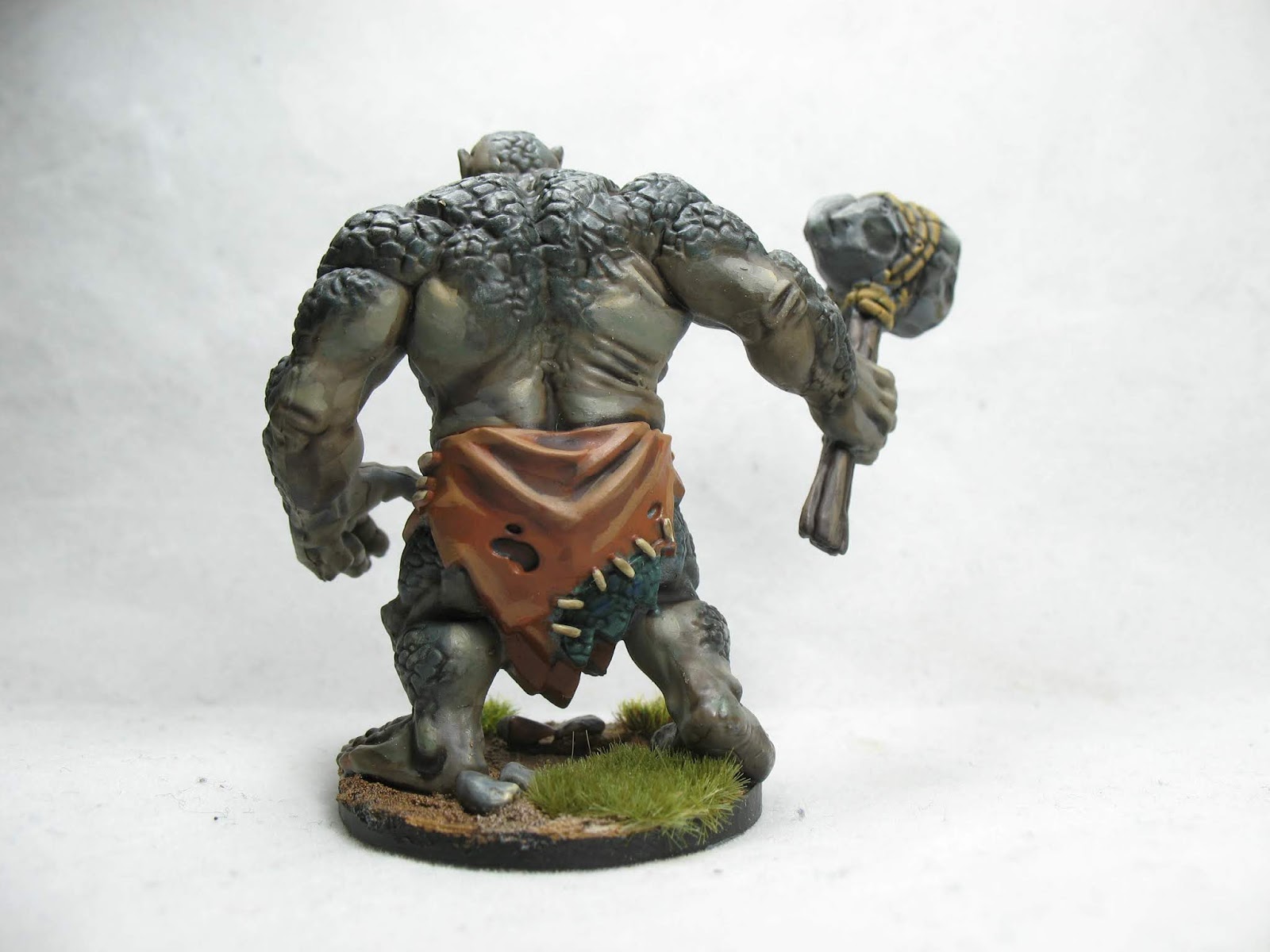
I've mentioned at least once that there is one more enemy to do to finish the set, but I'm going to hold off on it for a bit.  First off, I've never actually used the model in a game yet.  More importantly, I'm just not sure what I'm going to do with the miniature.  Now, that is pretty common when I work on models, as I kind of experiment as I go.  However, for whatever reason, this model strikes me as challenging, and as it is so big it is going to attract attention.  I'm going to hold off and work on other things for a bit, and so I started the first couple of heroes.

I thought it would be interesting to at least some of you to see the steps involved in painting a mini, to the tabletop standard that I usually go for.  Here is the finished product, and you'll see bit by bit how I got there.


I chose to work on these heroes first because their color schemes are so similar.  Both are elves, so they have similar skin tones, both are dressed brown cloaks, and they shop at the same boot store.

Before I do any painting, there is a bit of preparatory work to do on the minis.  It may be a surprise, but the first thing that I did was take a drill and make a hole in each base.  The reason for this is that I've found the best way to store my miniatures is using magnets.  


I didn't bother trying to get good lighting here, but I hope the photo gets the idea across.  The case is vertical in the picture, by the way.

I used to store minis in foam, but either the model fits loosely in the foam and rattles around, which can rub paint off, or it fits snugly, in which case paint can rub off when inserting or removing the mini.  It is sort of lose-lose.  Using magnets, the paint never touches anything (except my fingers), so there is a lot less risk of damage to the paint jobs.  Also, it is just easier to see every mini and know exactly which ones to pull out of the case.

A lot of minis have a recess under the base where a magnet can be glued, but these are attached to solid disks.  I could remove the models from their bases and glue them to something else, but that seems like a lot of effort, and instead a couple minutes with a power drill leaves a perfect space to insert a rare earth magnet.

With the magnets glued in, the next step is to wash the miniatures.  Sometimes I'm lazy and skip this step, but I've also gotten burned before by not doing it.  You see, when models are created, the molds are coated with "mold release."  It is similar to something like WD-40, and prevents the plastic from sticking to the mold.  The problem is that depending on how much remains on the model, it can also keep the primer from sticking to the plastic.  A simple scrub with dish soap and water, and then it can be left to dry.

Next, I prime the model.  Paint doesn't stick well to bare plastic.  A primer is a special layer that is designed to bond to plastic, and also give it a "grainy" surface that makes paint adhere better.  There are advantages and disadvantages to any color used to prime, but through experimentation I've found I prefer a dark gray.  My current primer of choice is Rustoleum 2x Ultra Cover "Flat Gray."  I wish it were just a touch darker, but this is the only primer that I can regularly prime in one attempt.  Every other primer I use, I hit the model, let it dry, and find massive areas that didn't get primer.  I retouch, and then repeat 2 or 3 times until I'm satisfied.

The last thing is to attach the model to a handle to make it easier to hold when painting.  I just use old pill bottles, and use dollar-store foam mounting squares to stick them on.

After all these steps, the models look something like this.


For these models I decided to start with the eyes.  Eyes are really tricky, and can either make or break a mini, so much so that it is often best to just leave them out.  (See the previous ruffians for an example of that.)  Because I'm still pretty bad at doing eyes, it is best to work on them first, so I don't screw up other things as I'm fumbling with trying to get them right.

I start by painting the eye sockets a dark flesh color, in this case Citadel's "Bugman's Glow."  I don't care if I go too far outside the sockets, as I'll be cleaning this up later.  I then took an off-white (Citadel's "Screaming Skull") and watered it down a lot.  Instead of trying to paint the eye, I pretty much ended up dribbling it into the socket, and then cleaned up the edge using the Bugman's Glow.  Finally, I took a black ("Abaddon Black") and thinning it as little as possible to allow flow, painting vertical lines down the middle.  When painting a mini, it generally looks better to have the irises a little further toward the outside than is really natural, because otherwise the mini ends up looking cross-eyed.


If you look closely, the eyes aren't perfect.  Elena (the female) has an eye that looks a little blobby.  Honestly, though, given the size, these are pretty good, and few people would ever notice.

On to the flesh tones.  As these are elves, I want them to be very fair-skinned.  So, other than the eye-socket stuff I've already done, I'm starting with what I'd normally use for mid-tone on the skin (Citadel's "Cadian Fleshtone").  I paint the faces and hands with this.  Other than avoiding the eyes, I go pretty fast with this, and don't worry much if paint gets on other parts of the model.  I keep the paint thin, the brush wet, and build up the color through multiple coats to try and keep the paint smooth.


Next, we add some tonal variation to the skin.  I start by putting a wash (Citadel "Reikland Fleshshade") into the areas where there are recesses... the ears, the fingers, and so on.  After that dries, I start highlighting with Citadel "Kislev Flesh," going over about 60% of the fleshy areas.

After looking at it, I decide that some of the transitions are too harsh, so I mix the Cadian and the Kislev flesh paints together and try to smooth them out a bit.


One final highlight, a mixture of Kislev Flesh and "Pallid Witch Flesh," kept do just a few prominent areas, and I'm calling the flesh tones done.... for Legolas.  I want to do another couple of things to Elena.

I don't tend to put a lot of makeup on my fantasy women, but I wanted to do just a bit to make her more feminine.  A mixture of Cadian Fleshtone and "" is applied to the lower lip, and a touch of P3 "Skorne Red" is mixed with Kislev Flesh and thinned down a lot to apply some blush.  I tried to keep both of these very subtle.


With the flesh tones done, I next want to work on the cloaks.  There are areas of the cloaks that are very hard to reach, so I'd like to get into those recessed areas before doing much else.  I think starting here I'm not going to take so many pictures.... This post is already longer than most people will read, and when things *don't* go well, I'm desperately trying to fix them instead of thinking about stopping to photograph.

For Elena, I decided to go with a fairly neutral-brown cloak.  The process went something like this:

Basecoat of P3 "Bootstrap Leather"
Shade of Citadel "Agrax Earthshade"
Decide I don't like the effect, and instead mix Bootstrap Leather with Citadel "Rhinox Hide" and try to put in the shadows manually.
Decide the shadows still look like crap, and do a *ton* of back and forth between 3 different shades on the spectrum between Rhinox Hide and Bootstrap Leather trying to get them to look decent.
Move on to highlights with Citadel "Steel Legion Drab," and then mix in "Zandri Dust" for a final highlight.
Again, go back and forth a bit, before finally saying "I give up, good enough."

Legolas was much the same process, just starting with P3 "Bloodstone" to have a more reddish-brown cloak.  I did try to do a bit of two-brush blending, with limited success.


Shirts are next.  The concept art colors are very muted and difficult to distinguish.  I'm reading it as Legolas having an olive, and Elena having a bluish-gray.

At this point, the models are really diverging, while I thought they would be very similar color schemes.  Such is the way mini psainting goes...

For Elena's shirt, I mixed Citadel "Dawnstone" with P3 "Cygnar Blue Base" to get a nice blue-gray.  That served as a basecoat, and I added more Cygnar Blue Base to do shadows, and Citadel "Ulthuan Gray" to do highlights.  That wasn't enough contrast, so I did a final highlight of pure Ulthuan Gray.

The ribbing, I started with Citadel "Incubi Darkness," but it really bled together with the previous shading.  So, I did a stark edge highlight with Dawnstone to try and separate the regions.

The trim at the bottom was also originally painted with Incubi Darkness, but I decided to switch to Rhinox Hide for more contrast.  I highlighted with some of the browns on the palette from the cloaks, and I've lost track of exactly what I used.

To break up the colors, I wanted the belt to be bright.  I started with P3 "Rucksack Tan," (I think... the label has come off the pot), shaded with Agrax Earthshade, and highlighted with some P3 "Moldy Ochre."  I'm really not happy with how this turned out, but in terms of composition I think I made the right choice.

For Legolas, I did a base coat of P3 "Ordic Olive," and then mixed in some Citadel "Sotek Green" and "Screamer Pink" to create a highlight.  For a second highlight, I just added some Ulthuan Gray to the mix.

Edging was some Rucksack Tan and Moldy Ochre, again.

I'm not sure if Legolas is supposed to have bare arms, or if he dresses in layers.  I chose layers, and so the tiny bit of cream showing was done with Zandri Dust and Ushabti Bone.


At this point, I doubt anyone is still reading, and I really want to get these models done, so I'm going to wave my magic paintbrushes and get the models finished.  I'll come back with photos to talk about the basing.

And, through the magic of asynchronous communication, they're done.  I've started by applying a layer of Vallejo "Brown Earth" Earth Texture.  This is basically a paste that you can spread around the base to give it an earthy, muddy look.  It has enough adhesion that I can stick a couple of aquarium rocks into it as well.


Next up, the rocks get painted with Citadel "Mechanicus Standard Gray" and the whole base, including the rocks, gets a drybrush of Ushabti Bone.  I'm rushing a bit to get these models done, and I don't let the paste completely dry, which causes problems, but I fix them as best I can and move on.


Next, the bases get a generous wash of Agrax Earthshade, and then I paint the rims black.


As a last step, I glue some "Gamer's Grass" tufts onto the base, and then you get the final product from the first photos.

If you made it this far, let me know either in the comment section below or on facebook, if this was at all interesting.  I have a feeling that my next couple of blog posts are going to be more along the lines of "I painted a thing!"  If I do another detailed post on the painting process, it will focus on on particular area rather than the whole mini.


Saturday, May 18, 2019

Painting Ruffians is Rough

A Bit of Theory, A Bit of Whining

As usual, feel free to scroll down to the pictures, and I won't be offended.  If you want to read a little bit about the process of painting miniatures, and why I found these models to be so difficult, then here we go...

Miniatures can be painted to different standards.  I can't even start there, though.  Let's back up and talk about what a painter has to do to paint a good-looking miniature.

When you look at an object, you may immediately register a single color, but there is a lost more going on that that.  Look down at your shirt.  Specifically, find some place where the fabric has bunched up a bit.  Now, your shirt may be one color, perhaps even white.  But if you look into the deepest part of that wrinkle in the fabric, it probably looks almost black.  The fact is, the interplay of light and shadow means that you never get something completely one color.  It is always a range of different shades and intensities.

Because of the scale of a miniature, there won't be those harsh shadows.  If something is painted a single color, there will be very little difference in shade.  It will look flat and unrealistic.  So, a painter has to "trick" the eye.  Some areas need to be darkened to look like shadows, and others brightened to look like they are being hit by light.  While there are other skills are involved, in general you can tell how good painters are by how well they implement this tonal variation.

Now, let's talk about how to rank the quality of a paint job.  Exactly what constitutes each standard isn't completely well-defined, but after giving it more thought than it probably deserves, the way I rate them is by how many steps it takes to do each region of color.  This ties to the above, in that usually the steps are making some areas shaded and others highlighted.

"Unpainted" is pretty obvious.  Whether bare plastic, or just primed, these are models that have yet to have any serious work done to them.

"Battle Ready" is a term that I first saw from Games Workshop, and it basically means 1-2 steps done for each color.  The colors are blocked out, and maybe a wash is done over the areas to get some quick shading done, but there hasn't been a lot of care given to the model.

"Tabletop Standard" is probably the most nebulous, because it means different things to different people.  However, I basically consider it to be 2-4 steps done for each region of color.  Some small areas may only get a base coat and a wash or a single highlight, but most should either get two levels of highlighting, or a shade and a highlight.  Important areas like the face should get a shade and two or three highlights.

"Studio Quality" is what is used for photography for books and packaging.  Typically, it involves around five steps per region of color.  The way I most typically see it done is to start with a mid-tone, then add a shadow, and then inside the shadow add a deeper shadow.  Then, add some highlights, and again raise up a portion of the highlighted area even brighter.  Often these are done with some sort of blending process to get the transitions to be very smooth.

"Competition Quality" may only do the same number of steps as the studio quality, but in some way takes it up to another level.  This may be intricate patterns added onto a cloak, or "object source lighting" to make it look the light is coming from a glowing orb or other light source in the mini.

At any rate, when I paint, I'm strictly going for tabletop quality.  I do try to push for the higher-end of it (rarely does anything only have 2 steps, and I will push some areas to 5 if I think they really need to draw the eye), but I know I'm not a studio-quality painter.

So why do I bring this up?  Well, for whatever reason, these models have felt like the standard number of steps I'd do for a region just isn't enough.  Things I'd normally leave with 2 steps, I have to push for three.  Things where three steps should look great, I end up doing four, because there just doesn't seem to be enough contrast.

Add to that the fiddly straps on the legs (I could write two or three paragraphs on those), and I just felt like I was working, and working, and working, and getting very little done.

In the end, I think the problem is that I painted these to the same level as I probably will do the heroes, which doesn't make any sense for trash enemies.  Oh well.

I did the fair-skinned ones first, so I'll start with those photos.

One of the minor things I did was give each one a different hair color.


I have far less experience painting dark skin.  In fact, I was thinking about it, and I can only recall one other model that I've painted with African-toned flesh.  So, this was rather an experiment.  I think they came out really well, but I now need to experiment with a lighter black skin, since these are very dark.


I felt much more limited on hair colors, so there are two with black hair, and one with gray.  I actually like the gray one much better.  Once again, it comes down to contrast.


There is one more enemy model to do (the troll), but I think I'll hold off for a bit before tackling it.  I'm not sure what to do with it yet, and while I consider it further, I'll work on getting the heroes done.

Saturday, May 11, 2019

Stuff I Painted (Week of 5/5)

Lord of the Rings: Journeys in Middle Earth

I'm not sure why this game has grabbed me so firmly.  It is fun, but there are many other games I have that I enjoy just as much.  The minis are incredibly high quality for a board game, but I have plenty of more expensive models that put them to shame.  Whatever it is, though, I find myself wanting to play this game over and over, and I also want to get the whole set (31 models) painted up as quickly as  possible.

So far, I've been working on the enemies.  I want to get the more tedious batch paints done while I still have momentum, and then I can take my time with the heroes.

Anyway, I figure people want to see the pictures, so without further ado...

I started with the Orc Hunters.  I needed some orcish archers for Rangers of Shadow Deep, and I figured these could work double duty.  I may have rushed these a bit.  Also, technically, I did the painting last week, but I didn't finish the base until after it had become Sunday, so I count them as completions for this week.


After those were completed, I wanted to get as many models done as quickly as possible, so I looked for the ones that would be easiest to do.  The wargs and and the wraiths immediately came to mind.

For the wraiths, I used some of Citadel's technical paints, "Hexwraith Flame" and "Nighthaunt Gloom."  The thing is, once I put them down, I decided there just wasn't nearly enough contrast.  So, I followed them up with a succession of drybrushes.  They were still amazingly easy to do, and I like the effect, even if there are only two regions of color.


The wargs were more drybrushing, along with some washes.  This was an example of my hating the way the models were coming out, but by keeping going I eventually found the one thing that was missing to make them look great.


After those, it was time to tackle one of the larger model groups.  I decided to experiment with a new skin color, both because I was curious as to how it would look, and because I wanted an easy visual distinction between the orcs and the goblins.  All in all, I'm pretty happy with the way these came out, though I could have pushed the contrast on the skin tones further.  Only three are shown out of six total.


The goblins took awhile, so for a little bit of a break I went back to orcs.  I actually did these at work, since I was actually caught up on things for the first time in the semester.  I probably took a couple shortcuts, like making the axes metal, when the sculpt looks more like stone.  I just made the assumption that orcish smithing wasn't as refined as it is for other races.


I spent most of today (and more than a bit of time yesterday) working on the ruffians.  I made the choice (mistake?) of giving them two different skin tones, which then led to requiring completely different paint schemes to get the contrast I wanted.  Because of that, I only got the three Caucasian-toned models painted, and I still haven't completed the bases.  I'll make another blog post once I have the whole set of six completed, because I think the extra time I'm putting into them is paying off.